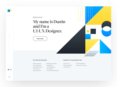
Homepage - DustinPutnam.com
Some early explorations of the Homepage for my personal portfolio. I wanted to go with something minimal that was simple and clean. Because it's my portfolio, the main call to action is to view my work. The sidebar would be sticky on Desktop HD, Desktop, and Tablet-sized screen widths.
Stay tuned as I continue to share my designs leading up to the launch of my site.
More by Dustin Putnam View profile
Like

