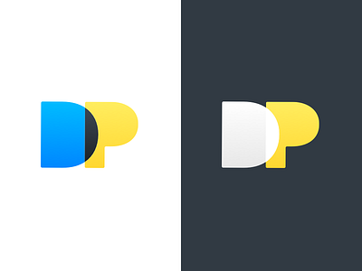
Personal Logo v2 - DustinPutnam.com
While I've been working on my portfolio branding, I've realized that I needed to shift from the original direction.
The first version I did felt a little too washed out and stuffy for what I was going for. This new version feels closer to the style and tone I am looking to use (brighter colors, slight gradients, and rounded corners).
Stay tuned as I continue to share my designs leading up to the launch of my site.
More by Dustin Putnam View profile
Like

