S.T.B Mobile Podcast Website
The first new screenshot that is not to do with the 100 Days project I completed recently!
Now that that project has been completed, I finally managed to get some time to start designing (and hopefully get to help) with the build of a new podcast website I am making for a couple of friends at work who run their own testing website.
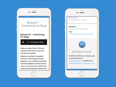
They asked for a full UI refresh and I feel pretty chuffed with the full episode details page so far. Especially on mobile with the drop shadow to make the episode the main standout piece on the page.
I also decided to include the "Getting in touch" banner to show off that subtle but sweet gradient shadow there too.
More by Michael Szeto View profile
Like
