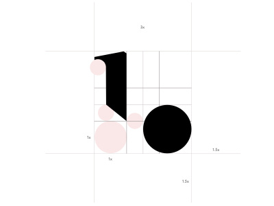
Self Branding Logo
Work in progress of my first logo design using the 'Golden Ratio'. Will be furthered developed to be used a my own personal branding.
I wanted to create a logo which wasn't just my named typed out in my favourite typeface. I wanted a logo which resembled what I love most about the design. Simplicity, Clean and Smart was the look I was going for with tribute to one of my favourite fonts series 'Harriet'.
Further development will possibly include shading creating depth or texturing. Keen to hear some comments on how I could take it further.
Like
