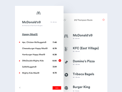
Clean UX
Pain Points:
----------------
1. While Selecting the menu, we don't even the image, because most of the people already order the same food that they have eaten in the offline shops (Based on my small research)
2. Though adding items is the primary action, in all the app, traditional peoples are following a small plus button to add that to chart.
Design Solution:
-----------------------
Provide user what we need ( Clean screen with hotel only name and time of delivery time)
Even no logos, edit icons in location (Because peoples know what app they are using and they intuitively know how to change the location)
Main Interaction solution is Wherever you click on the list of items that will get added to cart.
Though it's my point of view and solution, feedback is really appreciated
----
100 Best Interaction collection
----
Mastering-Interaction design through craft productivity and workflow
----
Sketch of Interaction Process
~~~~~~~~~~~~~~~~~~~~~~~~~~~~~~~~~~~~~~~~~~~~~~~~~
Looking for fascinating UI/UX job? I would love to listen to your needs. Email me johnsonux21@gmail.com
~~~~~~~~~~~~~~~~~~~~~~~~~~~~~~~~~~~~~~~~~~~~~~~~~

