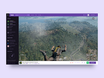
Twitch Desktop Site (Exercise Only)
Just practicing my UI/UX chops to try and get better. Decided to mess with the @Twitch desktop site.
Only sharing this to get feedback on the Online/Offline and video area elements of the design. I don't think they are terrible, but I do feel like there is room for improvement. Just a little cleaning up. Again, just for exercise.
I want to be careful to not discredit the original team or design. I have no idea the amount of behind the scenes work that had to go into it and I think the team is doing a great job.
Larger images attached, both with the sidebar open and truncated.
More by Troy Brennan View profile
Like


