Gibsons Tapworks
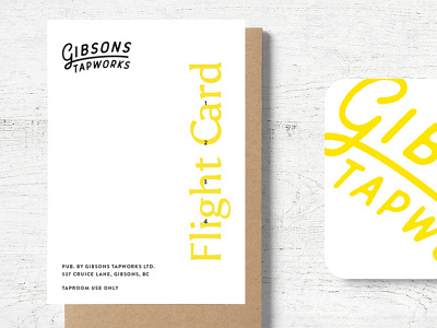
Examples of a flight card and coaster designed for the taproom of Gibsons Tapworks on the Sunshine Coast. We choose yellow to be the primary brand colour to stand out from the competition and act as a beacon in the rainy and grey environment of the pacific west coast.
Checkout this custom brand guide website we also setup to help them manage their brand, voice and application: http://mybrand.paonecreative.com/gt/
Role: Branding
Client: Gibsons Tapworks
Agency: Paone Creative http://paonecreative.com
Launched Winter 2017
More by Christina Lee View profile
Like
