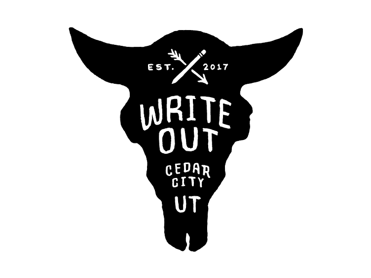
WriteOut Logo 2/3
This logo was an option I developed as we were trying to land on one logo, and it wasn't necessarily the client's favorite, but I liked how it could stand alone and deliver more information than the first logo. Its vertical orientation was also something I knew would be useful, so I suggested we keep it around and use a family of logos rather than just one. This one ended up kind of being the star of the show, appearing in the key art on the website, donor packet cover, poster, flyer, bookmark, banner, and T-shirt.
More by Brandon Jameson View profile
Like
