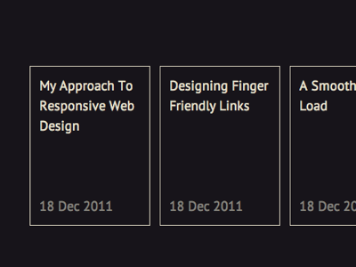
Horizontal list of blog posts for small touch screens
I tried making the list of blog posts in my upcoming redesign horizontal for mobile sizes. In theory, it's is a beautiful way to fit large amounts of browseable content on small screens.
In practise, only iOS5 users would enjoy it, and even for them it would be quite buggy (http://stackoverflow.com/questions/7808110/css3-property-webkit-overflow-scrollingtouch-error). On every other mobile OS/browser combination, the experience would be awkward at best, since most browser makers still don't seem to care about making horizontal scrolling actually work.
(The situation is equally bad with desktop browsers: many non-Mac users have mice that can't scroll horizontally at all.)
Lesson learned: horizontal things on the web are still incredibly goddamn awkward to pull off. Stick to vertical things. :(
