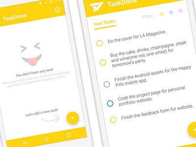
TaskDone - Main Screen
Still working on TaskDone application, now focusing on Android. On the left is the screen for the empty state, when there aren't any existing task, and on the right the normal screen with filtering options on the top right corner. Any feedback on how can I simplify these two screens or how to make them more UX friendly?
---
You can check it too and many other things on my Instagram or Facebook. Get in touch with me at me@eduardstefan.com
More by Eduard Ștefan View profile
Like
