#MakeItBetter: [Dribbble] Shot Details
Hey guys, after all the Scout commotion, I decided to try and see if I could come up with solutions to improve the UX in other aspects of the site. Kind of my way of giving back to @Dribbble and how I think it could be better.
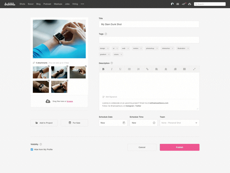
This is the Shot Details page after you initially uploaded the main thumbnail. The primary components I focused on were:
1. Changing the shot description input to a wysiwyg editor (with basic formatting controls) and ability to expand the editor view for more room and focus while writing.
2. Ability to have a 'signature' with every shot (can be edited either on this view or under Account Settings).
3. Updating the tagging system with auto suggestions and having a clear indication to see each tag entered.
4. Moving the schedule shot inputs (date and time fields) to this view as opposed to in a modal, removing an extra click.
Let me know what you guys think! Also, any feedback is appreciated!
![#MakeItBetter: [Dribbble] Shot Details](https://cdn.dribbble.com/users/689927/screenshots/3770629/shot-details.gif)
![#MakeItBetter: [Dribbble] Shot Details](https://cdn.dribbble.com/users/689927/screenshots/3770629/attachments/849091/tag_suggestions.png?resize=400x300&vertical=center)
![#MakeItBetter: [Dribbble] Shot Details](https://cdn.dribbble.com/users/689927/screenshots/3770629/attachments/849089/editor.png?resize=400x300&vertical=center)
![#MakeItBetter: [Dribbble] Shot Details](https://cdn.dribbble.com/users/689927/screenshots/3770629/attachments/849090/edit_signature.png?resize=400x300&vertical=center)
![#MakeItBetter: [Dribbble] Shot Details](https://cdn.dribbble.com/users/689927/screenshots/3770629/attachments/849088/shot-details.png?resize=400x300&vertical=center)
