Asos Redesign
One of my favourite places on the internet, Asos! 💁
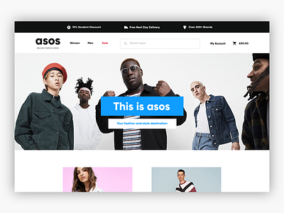
This is a redesign concept I have been working on, as much as I love the website, its kinda out of date. I tried to give it a refresh with modern flat ui colours, sans serif typography & a 1280 layout.
My goal was to make asos.com more user friendly, so I've been working on what I think the UX should look and feel like while shopping.
More shots to come so keep your eyes peeled🍌
Would love to hear your guys feedback!
More by Korey View profile
Like


