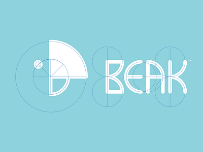
Beak Logo - Circle Grid X-Ray
These "circle over logos" pictures are overplayed, but this brand was actually designed with a circular grid in mind, so forgive me this one :)
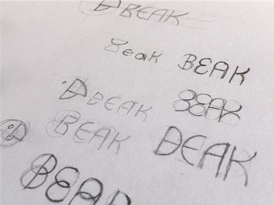
The circles and proportions helped form the mark, word mark, and some layouts. I would have liked for the wordmark to be a bit more symmetrical, but in the end the kerning of the wordmark needed to win out.
More by Josiah DePaoli View profile
Like

