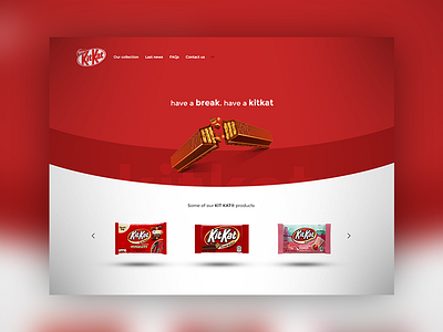
ThirtyUI Day #1 - KitKat® Homepage
Hello guys, I am back with this design for the first Thirty UI challenge.
-------------------------------------------------------------------------
The goal was to re-design the KitKat® Homepage by using the following "guide-lines":
1. Feature more appealing product photography.
2. The site needs to look more modern, clean, easy to navigate.
3. Feature some of other KitKat™ products on the homepage.
-------------------------------------------------------------------------
Tell me what you guys think, feedback is highly appreciated.
- Victor
More by Victor Bianconi View profile
Like
