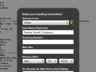
Delivery Status: Favorites, Take 9
I was playing around in Interface Builder and found the "round textured" style of popup, which seemed like it might be a better fit for the widget. I tweaked it a bit, but it's the same idea—a lighter grey, no gloss, and no divider next to the arrows. It's a subtler look and it fits with the rest of the widget so much better.
More by Mike Piontek View profile
Like

