Poly Platform
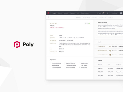
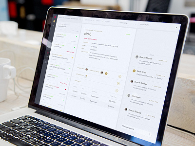
A shot from the updated poly platform design. After gaining some user feedback we discovered that they required a more familiar interface when scanning for information. We made a few adjustments including a stronger contrast in fonts to speed up the access to detailed information.
You can see the full project on our Website or on our Behance page
Like what we do? Why not open up the conversation, we are always looking to build new relationships and collaborations
More by Gravita View profile
Like

