E-commerce Analytics System Website Design
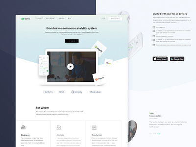
Goal: creating a top-notch homepage to represent a pretty cool analytics platform for e-commerce segment. We needed to instantly educate potential customers and just passers by about the product without going too fancy with the visual and style.
Approach: in order to get the message across to site visitors faster, we decided to utilize clean and minimalistic design with attention to most important points that would help visitors better understand the value proposition and give an impression of a professional vendor that can solve their business needs.
Result: we ended up with clean design, utilizing white space, with attention to detail. We kept the balance of visual simplicity of illustrations and text content, which, besides getting the message across, will also be SEO-oriented for better search engine rankings.
Let us know what you guys think, we’re happy to hear from you!
Press "L" to show some love!
Don’t forget to follow Zajno on social media and feel free to drop us a line:
Facebook | UpLabs | Twitter | Instagram | Zajno | Medium

