Rockefeller Partners Architects 02
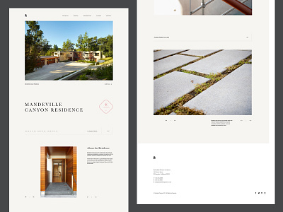

Another shot for a new Rockefeller Partners Architects website. The main goal was to simplify the site design by simplifying the color palette and adding more whitespace to the entire content so imagery came to main focus. Following the grid system and using whitespace as a graphic element I came to clean and simple variation of a layout. I am sharing with you few shots, let me know what you think!
EDIT: Full screen is added in the attachment
Check another variation:
https://dribbble.com/shots/3765288-Rockefeller-Partners-Architects