Flare 1.0 Selection Card Side-swiping UX

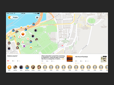


Flare Apps Flare selection cards as they look in 1.0 . A ways to go before its good, but already made great progress through many iterations and updates in 1.1.
The important concepts here are how to put a side-swiping system that exists in an easy to reach position under the friends bar, does not use variable height and rounded corners. The added benefit of doing a set height turned out 2B ease of predictability on the following swipe bc there are no more tall cards that leave a swipable map on the following piece of content.
Should be super useful for folks going to Burning Man. Help me get the word out ;)
If you like it, don't hesitate to click "L" 💗 or "F".