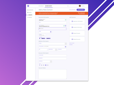
Contact Form Design Challenge
During a recent interview I was asked to redesign a lead contact form. The original had multiple columns of input fields and was overwhelming to the user. I decided to take a modular approach to the new design. This allows the user to add sections of input fields as needed.
What do you think? Let me know in the comments below!
More by Michael Bankhead View profile
Like
