To bottom navigate or not?

With the introduction of Material Design's Bottom Navigation, I get mixed feelings. Should I use it or should I not.
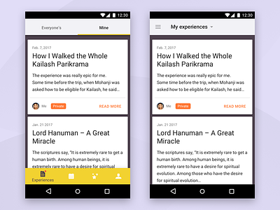
Basically, such a navigation is totally useful. The tab bar on iOS shows that it works and is the best ergonomic placement for navigation since it's easily accessible by the thumb. But below the tab bar, iOS has only the home button, and Android uses the familiar 3 hard-coded buttons which resemble a bit like navigation.
So when using the Bottom navigation on top of those 3 native actions it looks a bit like 2 rows of navigation stacked vertically. My design approach just can't digest that.
Are there any other Android designers who share mixed feelings like I do?