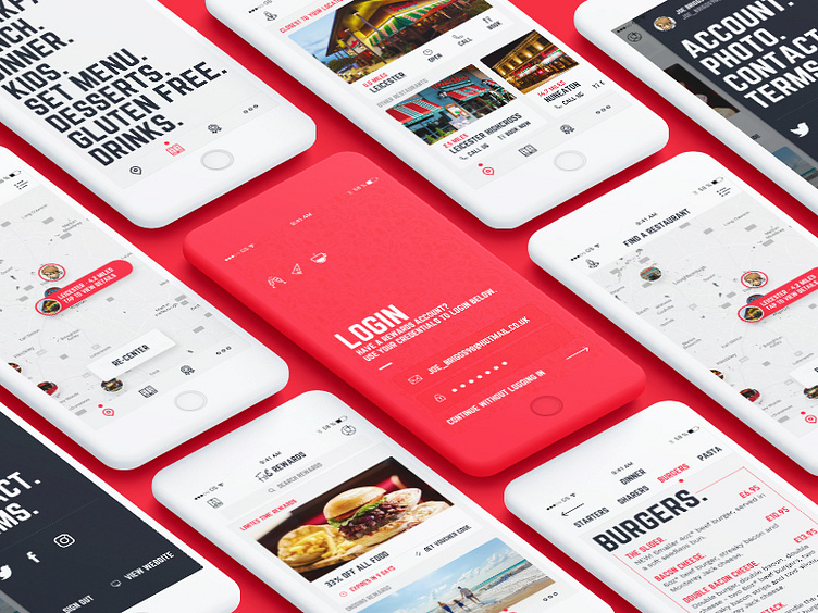
Frankie & Benny's iOS App
I recently experienced the Frankie & Benny's app and disappointedly, felt as though the design throughout the app was confusing and disjointed. It could be better.
Here is my thoughts on how the app could look.
I've cleaned it up — making it more natural to iOS users — the design has been brought more inline with the current trends today including the use of big & chunky fonts. The navigation has been cleaned up to be more coherent and an appropriate flow is now visible.
I'd love to hear your opinions. Constructive criticism is always welcome.
More by Paul Mckay View profile
Like
