Grand Rapids Griffins Fauxback Jersey Design

This was my submission in the 2017 Grand Rapids Griffins Annual Fan Jersey Design Contest. The Griffins are an AHL hockey franchise that is near and dear to me with their affiliation to the Red Wings.
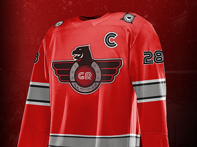
This years jersey design concept was 80's fauxback. I decided that the lame submissions that literally take the 80's pop culture references were played out and went for something much more authentic.
The Jersey itself features a color scheme and sewn stripes that take cues from the current franchise image and imagines what if the Griffins Organization was around in the 80's: a time of very solid authentic jersey concepts (which they weren't).
The retro typeface continues this idea while adding to the minutia of the simplicity.
The main logo is a simplified take on a griffin spreading its wings and circling the GR Retro typeface. The side profiled nature of the griffin allows for a nice simplified shape while still creating a new viewpoint of griffin silhouette. The stars around the center of the logo draw influence from the Clarence Campbell Conference All Star Jersey of the 80's NHL. Heraldic sewn Embellishments add simplified refinement to this fauxback concept.
This concept is a finalist for this years contest and the Griffins Organization is set to vote on and make their final selection Friday.
Wish me Luck!
-Kurt