Sweet pud'n 03
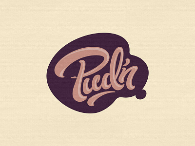

WIP logo for a London-based subscription retailer who's launching a new product line that tastes like various desserts.
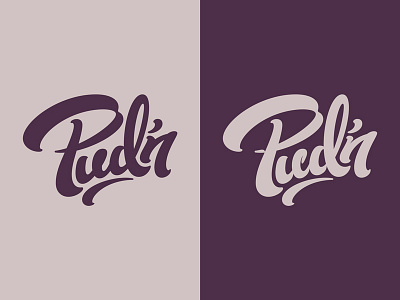
I put this sucker through a pretty extensive round of self-editing. The most noticeable changes to the lettering are the P and n. I ditched the broken stroke look in favor of smooth curves. It definitely looks better to me now.
The holding shape and highlights will come into play more on the packaging. More on that later.
See attachment for simplified flat versions and social icon.