MTA eTix Redesign
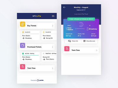

I redesigned MTA eTicket app's ticket activation process.
As for the interaction, I am fairly new to the Principle (prototyping tool) and I am still learning what's possible.
Problems:
- Time it takes to get to the activated ticket to show it to the conductor (Currently it takes 3 taps to get to the ticket)
- Confusing information hierarchy
- Dated look & feel
Solutions:
- A streamlined process for getting to your ticket
- Clearer labeling of the features
- Better information hierarchy
- Improved look & feel but still stay within the branding in terms of colors used.
Any feedback would be greatly appreciated!
