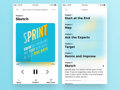
Audio book app
Audible has been grinding my gear lately, mainly because of how unusable trying to select a chapter. When I wanted to go back to the chapter I wanted to read, I never know which one it was because of the missing chapter titles in the menu.
To ease my brain a bit, I've taken the liberty to refine their messy UI in the player, simplified menu navigation, cleaner interface, and most of all - adding chapters and chapter description to the experience
More by Michael But View profile
Like


