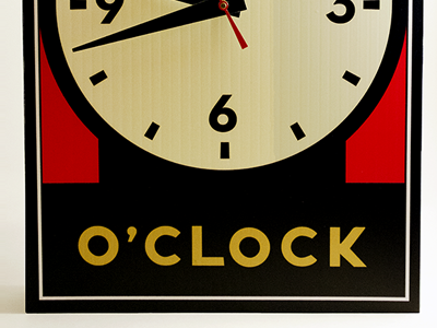
Michael Schwab Homage Clock
Objective —
Develop a clock that pays homage to designer Michael Schwab. The clock must reflect the “spirit” of the designer through various characteristics including its structure, color and composition.
Development —
I looked at various aspects of Michael Schwab’s work and identified the basic concepts of his designs that define his style. I focused on the colors he used in his pieces, the composition of his most renowned work, the typeface he used, and the subject matter of his illustrations. I researched to find that Schwab used Neutra Text as the typeface on his popular landmark posters. I also pulled various colors from the same posters and experimented with the different color combos for the clock. Since the same landmark posters have an illustration of the subject matter defined in the title that resides at the bottom of each poster, I created a clock illustration to be the defining element of the piece. Also, because Schwab worked with two-dimensional pieces, I decided to fabricate the clock out of corrugated plastic with a decal to not only keep the clock as flat as possible, but to also add to the durability of it.
--
More at http://www.carlyculver.com/michael-schwab-homage-clock
