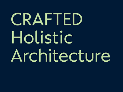
Letters/Typeface for architecture branding project
A logotype alternative that we are expanding into a full character set. It's a mix of geometric feel with calligraphic terminals and finish (we have referenced classic sans from old specimen books (Berthold for example) and contemporary typefaces of excellence such as Verlag, Mallory, Neutraface and others. Caps follow classic proportions.
If client approves, it will probably become their proprietary typeface. In order to become more usable as a typeface, we will need to fix the x-height. It's now adjusted so that the logotype is more vertically compact and can be used stacked and form a nice sillouette/type-image.
More by Plau View profile
Like
