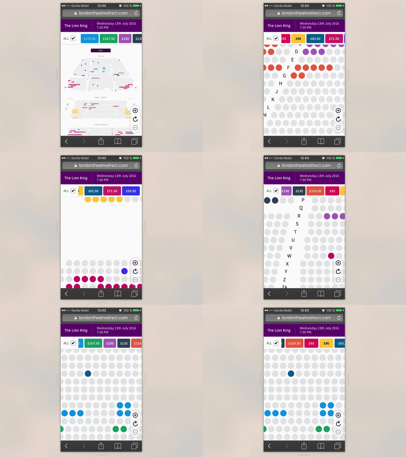
LTD Seating Plan Mobile
Hello people,
This is mobile version of LondonTheatreDirect seating plan where users can choose a particular seat in a Theatre. Recently I found problem that is increasing cognitive load during the task of comparing seats and figuring out the price.
Seating map legend with price bands is sticked to top, but user have to scroll to find the particular color of the seat. Which is not intuitive approach and whole layout looses it’s power.
I ended up with a clever solution. Again using @Framer. This is was exactly the project where Framer came very handy. I used only 1 method calling (Utils.modulate) to bound scrolling of seating plan to scrolling of price bands. Framer was the best choice for this kind of interaction.
Hope it is clear how it improved the user experience.
Cheers!
