Co - Logo Design
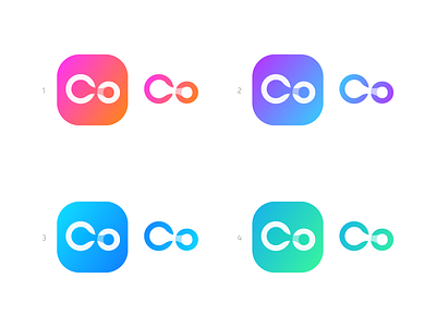
Co Logo concept which are the first two letters of the companies name. Main focus is to create an creative and suiting wordmark with a single and smart element included. Since the client preferred to stay anonymous for now, these two letters I present to you because this can also be a potential logo mark.
The idea of this concept was to connect the C+o (in the wordmark) in a smart and appealing way. Within the C+o there is a subtle 'bubble' included and somehow shows the infinity loop of the 24/7 support.
I would love to hear your thoughts and a possible fav out of these color variations!
_
These concepts are made for a Premium Web hosting Provider, for now I couldn't tell much more until its final and live.