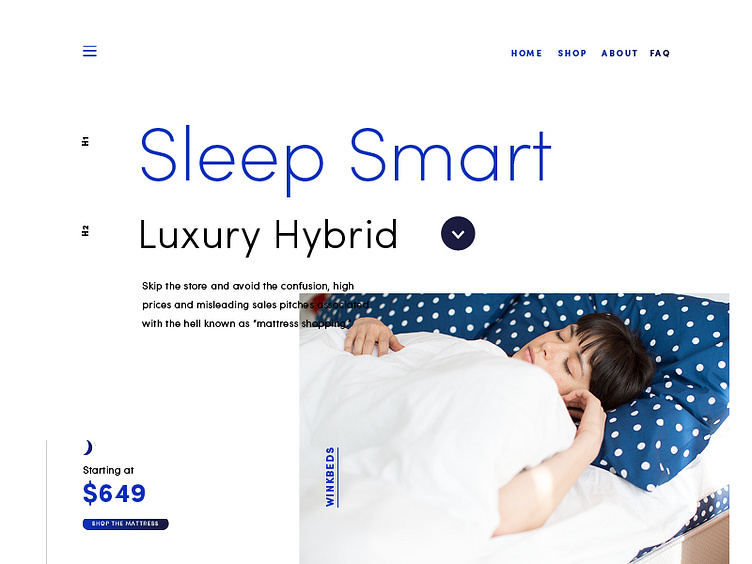
Winkbeds Website - look and feel #3
Uploading some work from last year - this was a look and feel project for a client. I started off with some key phrases (Upscale Fashion, Homegrown Americana, Minimal Tech) and grew the directions around these. This one is 'Minimal Tech'.
I wanted to have a paired-down visual solution (enlarge view for better look). The client's offering is a temp-controlled mattress.
Fonts: Sofia Pro family
More by Miss Alicia Li View profile
Like
