Full Screen Burger App 2.0
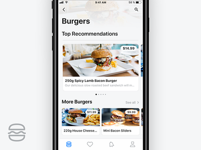
Continuing my ongoing series designing my old work. Today is just small colour tweaks and showing the entire first screen.
I made the icons and fonts darker, giving them better contrast. I also added more of a blue hue to the background colour and all the icons.
Feedback is always welcome! 🙌
Check out the project Burger App
Follow me on Twitter
Follow me on Dribbble
More by Judah Guttmann View profile
Like

