Yelp Redesign
Have you ever used an app and thought that it could be designed better? Well, everytime I use the Yelp app, I think to myself, "This could be more intuitive." Below is the process that I went through to redesign the Yelp home page. Enjoy!
First, I started by conducting user interviews with people who use the Yelp mobile application. I provided a questionnaire that included topics like "most used features" and "interest in new features". I found that the majority of people use Yelp to find new and highly rated restaurants. The feature that users were most interested in was "Top rated restaurants near your current location".
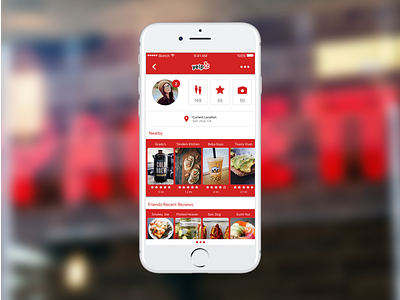
I came to the conclusion that the new home page should include dynamic information based on the user's current location. The visual data should include the restaurant name, a photo, rating, and distance from current location. With this information, the user can quickly scan through the options and select the restaurant of most interest.
I then sketched out wireframes with pen and paper, turned those into low-fidelity prototypes, and finally the high-fidelity prototype that is seen above.
