Website Redesign for Global Finance Loan Company
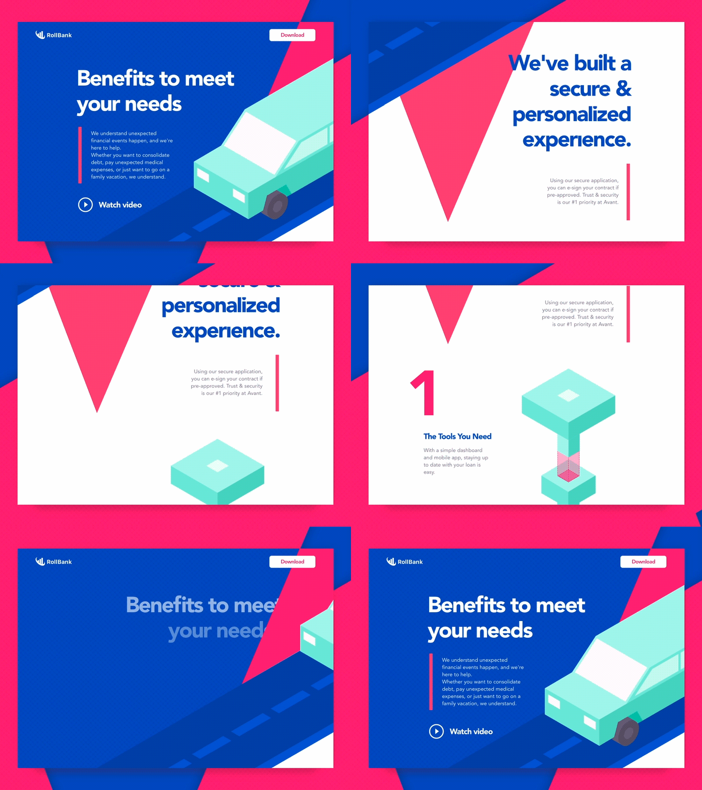
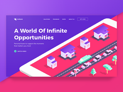
Goal: redesign of our client’s website for attracting young entrepreneurs that apply for small business loans. The graphic content we created for the website is used metaphors that symbolize different approaches for selecting the right type of loan. Our area of focus was creating a seamless web user experience to let the young and aspiring site visitors discover more about the loans and give that “live” and colorful feel of the overall aesthetics.
Approach: we used a vibrant and trendy color palette that’s been pretty trendy. The isometric illustrations create an illusion of several dimensions, adding more depth to the design. The organized chaos of elements movement reflects the innovative approach of the client of ours. Sharp and geometric shapes represent guaranteed security and reliability of the services offered.
Solution: We ended up with the design that contains elements that go beyond one dimension and look vibrant and “live” at the same time to attract the target audience, by taking advantage of some bold typography, color matching and location of objects.
Press "L" to show some love!
ᗈ Join our Newsletter! ᗈ Website ᗈ TheGrid ᗈ Spotify ᗈ Twitter ᗈ Medium ᗈ Facebook ᗈ Instagram

