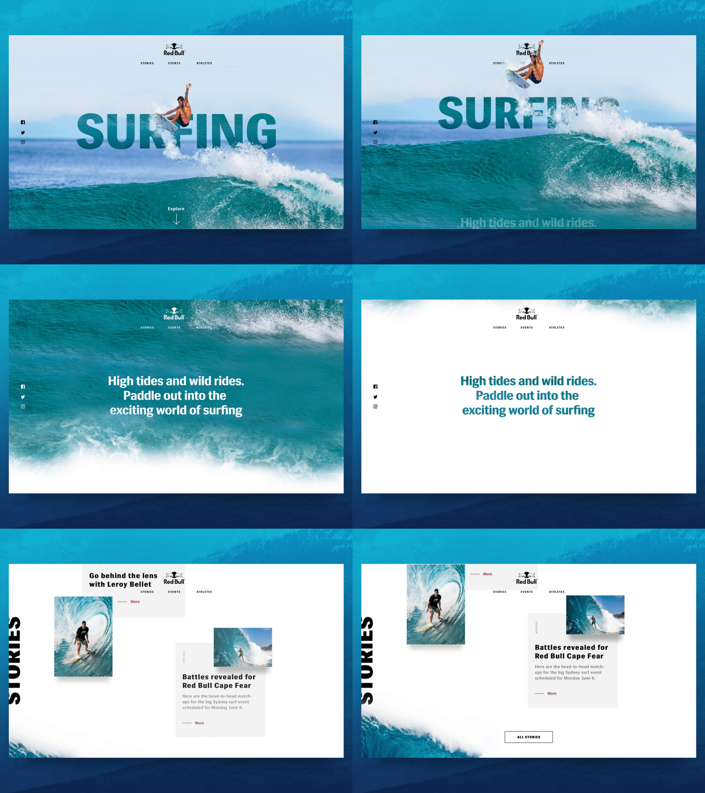
Red Bull Surfing - Landing Page
Last week we had a bit of free time because #summer, so @Ieva Sliziute and me jumped into a small side project to experiment a little with design and animation.
Despite having no summer or whatsoever in Berlin, we went for something refreshing and decided to create a landing page concept for Red Bull about surfing. We wanted to experiment with parallaxes and layering, trying to give an illusion of depth.
This is the first part of the website animation, the second part will follow soon :).
Let us know how do you like it!
More by HY.AM STUDIOS View profile
Like


