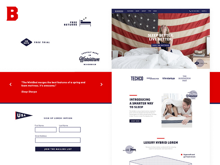
Winkbeds Website - look and feel #2
Uploading some work from last year - this was a look and feel project for a client. I started off with some key phrases (Upscale Fashion, Homegrown Americana, Minimal Tech) and grew the directions around these. This one is 'Homegrown Americana'
I wanted to add in a few touches of illustration here, as I think it adds to the overall aesthetic and introduces some value propositions in a refreshing way. These illustrations would be parallax, following you down the page
Fonts: Brothers Bold, Sofia Pro Light/Bold, and Viktor Script
More by Miss Alicia Li View profile
Like
