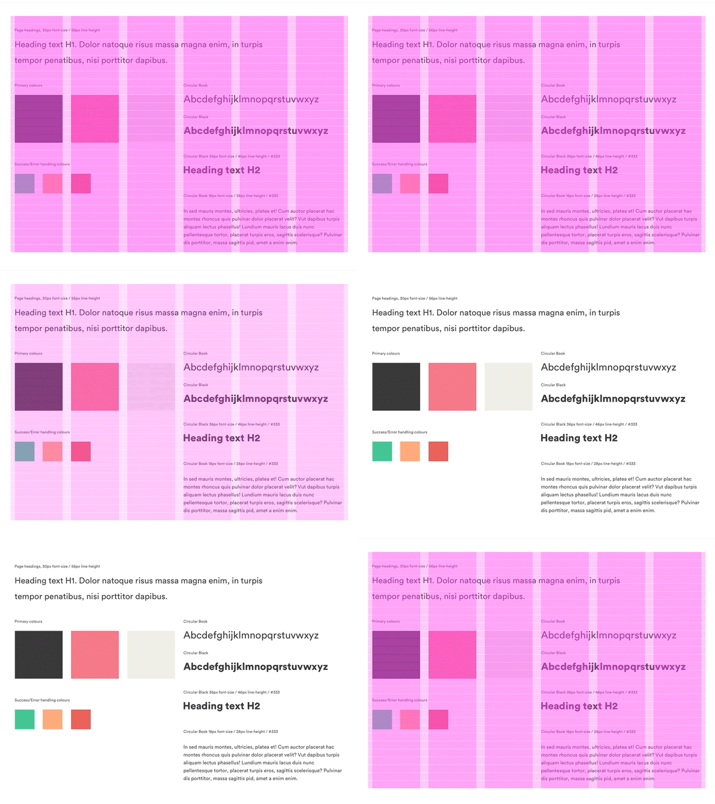
Style Guide - Vertical Rhythm
A detailed style guide is a great tool when designing user interfaces. One element that is often overlooked by many designers is vertical rhythm. Horizontal grids have been widely adopted for a while (from 960 to bootstrap), but a systematical vertical rhythm helps both designers and developers work more efficiently.
Attached is a simplified style guide in Sketch for reference, but the focus here is the vertical rhythm. The line-height of the design is 28px, so the rows are setup with a gutter height of 1px and row height of 27px.
Font used in Sketch file is Open Sans.
style-guide.sketch
200 KB
More by Digital Creative View profile
Like
