WCAG 2.0 Color/Contrast Compliance Chart
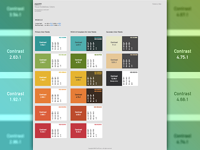
While designing my new web identity, I'm making sure to closely follow the WCAG 2.0 color and contrast guidelines for accessibility. The ultimate aim is ease of use for everyone, including people who don't have 20/20 vision.
This screenshot depicts the colours for my identity (on the far left) and the WCAG 2.0 compliant alternatives in the middle.