Radiology Website
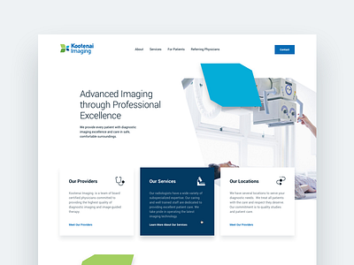
I'm working on a side project for a Radiology Group. Here's a look at the initial design for their home page.
One of the things I've been focusing on as a UI designer is incorporating branding into UI. So often it's easy to fall into habits of using the same thing over and over. Ironically this layout is one of the most used in websites today. But I think it works given the audience, and because the branding permeates the shapes, color and overall vibe of the site.
More by JT Grauke View profile
Like

