UPS Logo Nostalgia
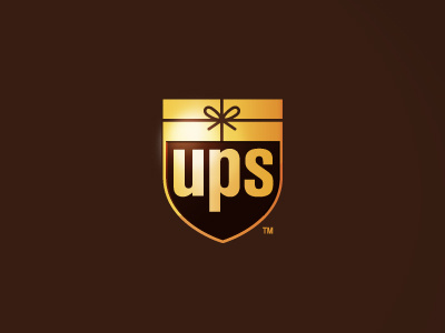
I know this is long since past but when I was in design school in 2003, UPS decided to rebrand themselves and do away with the (in their opinion) non-current package design above the shield. This was in the opinion of my professor and many design professionals, absolute sacrilege... After all, this one logo is one the most well recognized and highly regarded ones of renowned designer Paul Rand. At the time I really had no opinion on the matter, considering I was still learning the craft. Through the years however, I have grown quite fond of the graphic simplicity and style of Rand and many others that came before me and wondered that if it was me assigned to rebrand their logo at the time, how would I approach and execute it?
This is my nostalgic take on their logo update. I wonder if it would have been successful or tanked like the GAP logo redo? If anything, it would have at least been a good homage to the Rand version...
