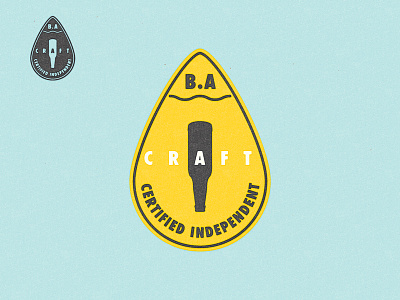
Brewers Association Certified Seal Challenge
I also thought there might be better ways to design the seal so that impedes less on brewery packaging. I took a few hours and crafted a few examples for fun.
While understanding that the upside down bottle of the original is the notion of craft turning the beer world "upside down," it does a disservice to the many breweries who also can (or exclusively can) their liquid gold. It's not about the container but what's inside it.
Top seal features a flag to signify independence (which is applicable since the BA is a US org) with the
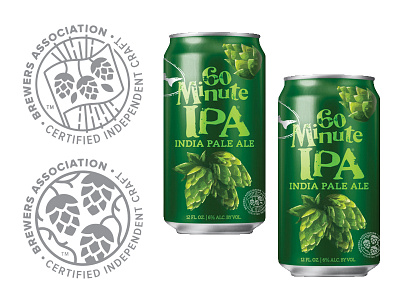
Either of these seals would be easier to incorporate into packaging, due to using one color and low contrast. These can be multiplied or colors changed to fit the breweries branding. They can also be smaller than the BA's and still be legible. Simple enough to be near the front of packaging rather than on the back. Those looking for the seal will still find it, and those not won't find it distracting.
It is, after all, about letting breweries remain independent.
Hope others try this challenge- Cheers!