YouTube redesign
Navigation:
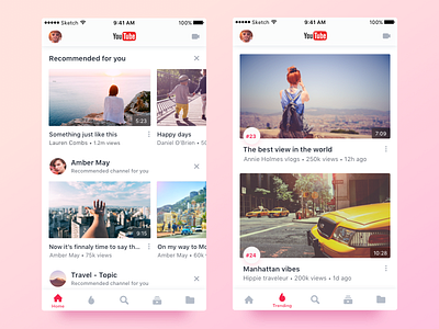
• Search is moved from nav bar to tab bar. Being a major page it has to be located with other major pages and easily accessible.
• As nav bar content is not tab bar dependant, tab bar is the only tab identifier. In this case having title appear on only the current tab would emphasize the current page title.
Home:
• To give content context it is segmented by category with titles added, just like in web version.
• Video cards are bigger for better content perception and for more space for title text.
Trending
• Trending position added as an important related information.
• Channel picture removed to stay in line with other pages, to avoid confusion as what that picture relates to and to free up space for title text.
Update: I'm glad YouTube agrees with me. Now some videos in the home tab have context added. (Oct 18)
Update: I'm glad YouTube partially agrees with me on the categorisation and layout in the home tab. (Jan 19)


