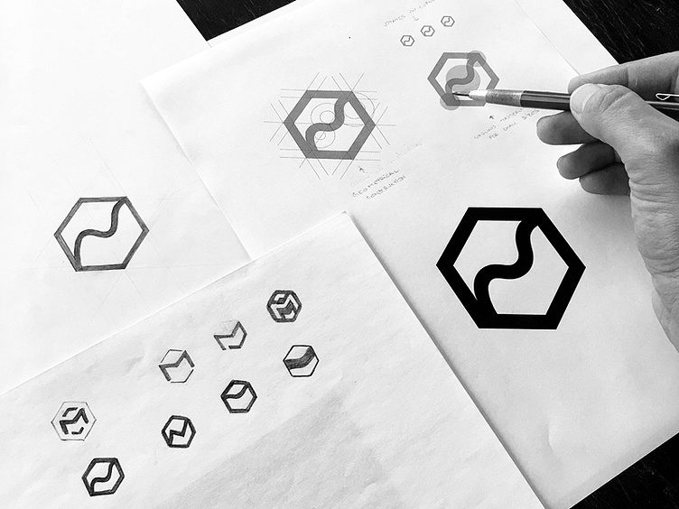
Magently logomark design process
Hi everyone, here is a process shot from the logo design done for Magently, a web development company specialized in e-commerce development. From sketches to final vector, here you can see the roadmap of the selected direction. The process went like this - after loads of directions drawn, this was selected for further refinements, then re-created using a geometrical grid in Illustrator (middle-top). In order to improve the flow certain adjustments were made to the curves. Also I had to tapper the portions of the curve where it was meeting the hexagon (bottom left and top right) to make sure that at small sizes the mark remain clear and those certain areas don't appear thicker than the rest of the line's weight.
More by Blackboard Agency View profile
Like
