Energy Verbs
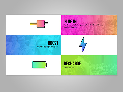
Section on the homepage of a conference website. The conference's theme is "POWER UP". I chose this layout instead of three icons across with text underneath each. Wanted to try something different and I think this will adjust nicely to all screen sizes.
More by Sarah Strelz View profile
Like
