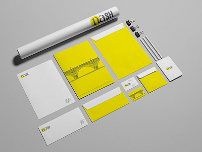
Nash Capital Partners
The brand identity of Nash Capital Partners signifies its purpose of existence, the culture and what it stands for. The blend of typeface used for the brand portrays the journey that the firm helps a business or an organisation to undertake, in its growth to the next level.
The comparatively old serif typeface travels to become a modern sans serif typeface depicting the modern thinking the brand instills in its clients. The lower case of the first two letters changing into upper case in the last two letters shows the commitment of the firm to make its clients stronger and future ready in a highly competitive world. The use of typeface in this format etches the multiple levels of thinking of the brand on all aspects.
In all, Brand Nash is a bridge that helps the clients to cross over into a progressive, modern, new world of business thinking.
