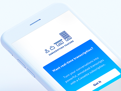
Subscription Feature Illustration
Here's a recent screen with illustration that I designed in preparation for moving our payments to web. Each icon represents a subscription plan. I wanted to use an illustration to make a big obstacle in the user flow just a little less annoying, in the event we're required to move the current payments flow outside of our iOS app (and not allowed to link to it).
Thanks @Spotify and @Amazon Design for examples of how other companies deal with iOS payments obstacles.
Thanks for looking – let me know what you think!
More by Jake Doering View profile
Like

