ItsON Purchase Flow UX Fix

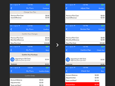

Identified and fixed the navigation labels in the ItsON Telecom eCommerce buying flow. Note that in the first column the buy button is called "Confirm Order" and Navbar Titles take up two bars.
I've proposed several ways the whole flow can be reduced to 1-2 pages but at the time there was a technical project constraint.
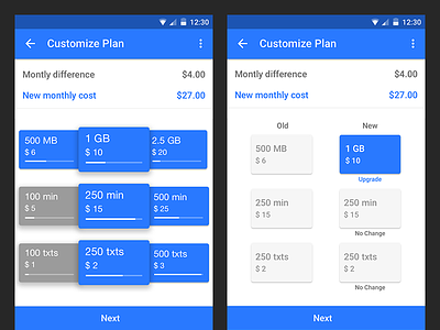
Attached full comparison including the version for Android's SAAS client of this system.
If you like it, don't hesitate to click "L" 💗 or "F".