Pixel Perfect Flags
With extra-mural activities taking up most of my time, and taking me away from my laptop more and more, I've been looking for a way to refresh my skills as a designer.
An area of interest to me is all the 'boring' stuff us designers try to skip. Stuff like credit card icons, country flags, etc.
I figured it would be a good place to start. Little did I know how big a project it could be!
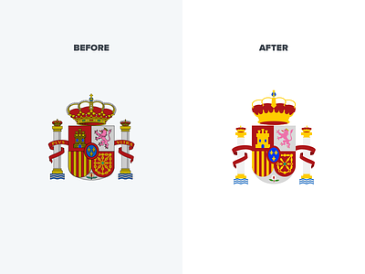
But it's been fun, I've been really focussed on making sure each flag scales beautifully and in many cases that has meant redoing flags entirely. My aim has been to try and simplify the flags without stripping away what they represent.
By sticking to a strict grid structure I've been able to maintain proportions and preserve their look. Here's a preview of the emblem on the Spanish flag.
I'll post more as I get closer to launching the flag pack :)
