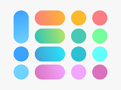
SubstanceAbuse Gradients / Colors / Palette
We've added gradients to give a more unique touch point in the branding. A combination of complimentary color tones create an identity that extends the visual conversation between the brand and the user.
Beginning from dark to a lighter shade, the gradient represents to journey towards the light; the healing process. All colors are used from the complimentary color palette.
Project designed for @Series Eight
Looking for a branding agency? We would love to help you.
Reach us at matis@matisbranding.com
More by Matis Branding View profile
Like
