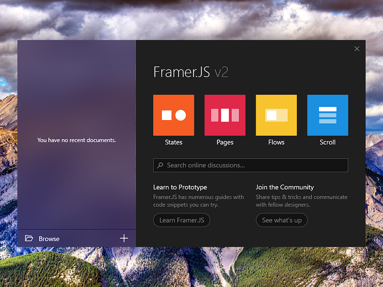
Framer.js UWP Welcome Screen
Hey guys, first post here. 👋 I took a stab at what a Framer.js Windows app could look like – here’s a welcome screen.
I’d like to thank @Jason Cho for the invite – Jason is a hard-working and passionate UX designer whom I met while I was at @Google and he’s been a tremendous resource and source of inspiration for me. Check out his profile, he’s great!
The Windows platform and design system are pretty interesting to me: Windows has this flatter/more geometric and colorful design system that scales well to all devices, from phones to Xbox and Hub. That being said, I don’t see many people making designs for Windows, and I generally think of its design language as underused/undertried. The Universal Windows platform has conincidentally a huge growth potential that’s unfolding and I think we’ll see a lot more of those apps in the coming years, and hopefully great UIs as well!
Now let me expand a bit on my process designing this screen. I first start in XD with the Windows UI kit and the standard controls and tweak as needed – there’s a fine line between using the standard UI which feels consistent and makes the app blend into its host system and going with a tailored UI which will feel special and delightful.
The acrylic brush you see on the left pane is the 60% brush that’s available as an API in the Creators Update and will ship as a XAML brush in the Fall Creators Update. All the type sizes (13px, 15px, 34px) are vanilla from the Windows type ramp. The other thing I do to be decidedly native is taking shots from existing native elements ; in this case I looked at Word Mobile’s welcome screen which the left pane is remniniscent of and the Windows toast notification which gave the check mark, and the background color of the right pane. There are five graded tones of gray in the picture going all the way to #1F1F1F for the background and #131313 for the controls’ background. It all fits into a rational system: white underlines the central elements, the close mark – somewhat secondary – is a little dimmer and the version number which is a subsidiary information is shown in a darker gray. The searchbox is the native Windows AutoSuggestBox, with the search icon moved to the left handside and colors according to the theme. [UWP has two themes, clear and dark that apps are expected to follow, but one can write a ThemeResource override in XAML to tweak the default theme colors and consistently apply those colors to the whole app.] Also, just the once will not hurt, the buttons that lead to secondary web actions are rounded to convey that they’re not dialog action buttons (e.g. OK/Cancel) but indeed sideline resources. The example swatches have a very slight 1px rounding which makes them just a little soft in the broader geometric Windows UI.
Are you excited by UWP and Fluent Design on Windows? Hope you like this shot either way! 👾
